Back in April, I wrote about a test that Facebook was running that would change the text rule in ad images.
For advertisers who have struggled with Facebook’s 20% rule, there will be premature celebrations. While the 20% rule will no longer get your ad rejected, very little actually changes.
The Old 20-Percent Rule
For a few years now, Facebook has enforced a rule to limit the amount of text in ads. If an ad image consisted of more than 20-percent text, the ad would be rejected.
This was enforced by Facebook and managed by advertisers using a grid tool. If an image is broken up into a 5×5 grid, it could not have text in more than five of those squares.
Of course, this was a simplistic way of looking at text in images. As many advertisers figured out, it wasn’t always about the amount of text, but where that text was located that would result in a rejected ad.
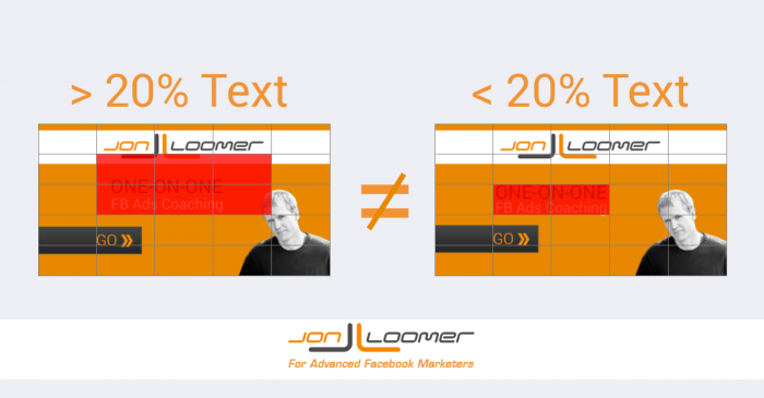
In the example above, I could simply move the same amount of text to stay within the rules.
Many advertisers struggled with this. They’d eyeball the amount of text that could exist in an ad and then get bogged down in ad rejections.
Veteran advertisers saw this as a minor speed bump. We used a tool like Photoshop that placed a grid over our images while we created them so that we always knew whether an ad image would be approved. There were never surprises.
But it caused confusion for most advertisers nonetheless.
Why Facebook is Changing the Text in Ad Images Rule
The test that started in April will be rolled out to all advertisers. I reached out to Facebook, and here is the statement I received from Afsheen Ali, Product Marketing Manager at Facebook, regarding why the change is being made and how it will impact advertisers:
Our research has shown that people demonstrate a preference for ads with less text. Previously, if 20% of an ad image’s area was text, it was not approved to run on Facebook, Instagram or the Audience Network. We’ve heard from some advertisers that this can be confusing, as it’s not always clear that an ad does not meet the policy requirements until after creative has been submitted. We are shifting to a new solution to improve this experience which allows advertisers more flexibility while still allowing us to maintain an enjoyable experience for people.
The Change to Text in Ad Images
This change hasn’t yet been rolled out to me, so for now I’ll refer back to the article I wrote in April. Facebook assures me that my original post was accurate.
Your ads will no longer be rejected for having too much text. However, the more text in your image, you can expect less distribution and higher costs.
Images will no longer be broken up into a 5×5 grid. Going forward, Facebook breaks down text density into four categories:
- OK
- Low
- Medium
- High
Facebook also provides examples of each and what to expect regarding distribution.
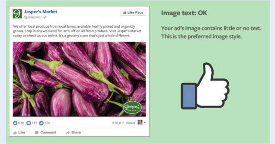
Image Text: OK
Facebook prefers little or no text in an image…
And here are three examples…
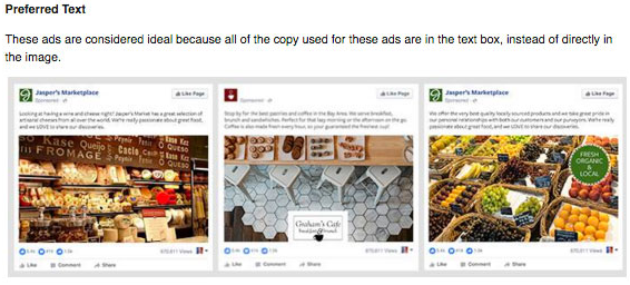
Facebook wants us to keep copy within the text box and off of ad images.
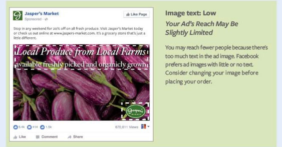
Image Text: LOW
But you may want to include some text. Here’s an example with a “low” amount of text in it, similar to what we may see in current ads…
Here are three more examples of “low” text…
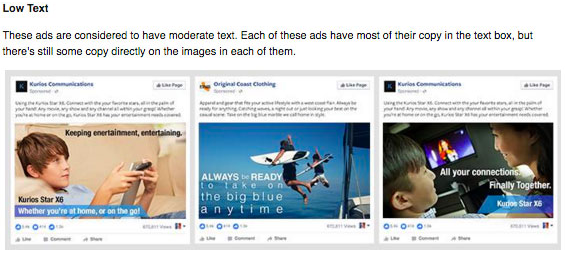
In each case, Facebook says you can expect reach of your ads to be at least slightly limited.
Image Text: MEDIUM
Add even more text (in this case, some next to the logo), and it will be classified as “medium.”
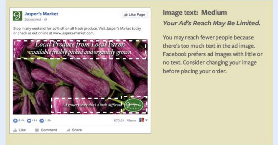
Here are some examples…
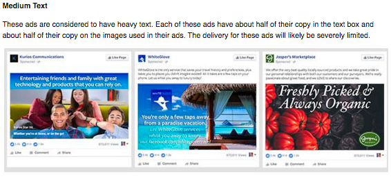
While Facebook labels it as “medium,” the examples they give have “heavy” text and they say that reach will be “severely limited.”
Image Text: HIGH
Then there’s a matter of really pushing the limits and using “too much” text…
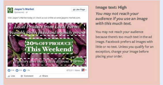
Even in this case, Facebook won’t reject your ad. You just may not get it shown.
Here are some examples…
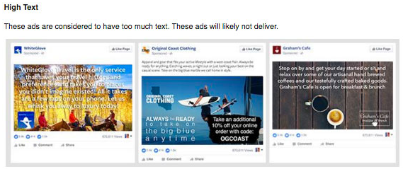
While this ad will get approved, you should expect very little reach and high costs.
Some Exceptions
Facebook also notes that these guidelines don’t apply to the following:
- Movie posters
- Book covers
- Album covers
- Product images: Where an entire product can be seen, and not just a zoomed in image of the product
- Posters for concerts/music festivals, comedy shows or sporting events
- Text-based businesses: Calligraphy, cartoon/comic strips, etc.
- App and game screenshots
- Legal text
- Infographics
How Facebook Will Apply These Guidelines
One of my questions regarding this originally was whether it was simply an expectation (users don’t like text in images, so you should expect less distribution and higher costs) or something Facebook would actually enforce. I received clarification that it is something Facebook will enforce.
So as you increase text in your images, Facebook will respond accordingly by making it more difficult to be seen. And if you really want it to be seen, the costs will be high.
Tools for Advertisers
The rules are now a bit more ambiguous. Previously, an advertiser who used a grid tool on their images would always know where their image falls (more or less than 20-percent). Now it’s a matter of Facebook determining whether the amount of text is OK, Low, Medium or High.
Facebook will be updating their grid tool so that you can upload your images and get immediate feedback on where they determine text density falls.
Additionally, whenever you create an ad in the ad create tool or Power Editor, you will be given a warning that lets you know if the amount of text in your image may limit distribution.
What You Should Do
For someone who prefers certainty while creating my images, this isn’t ideal. It would seem that not using the grid could result in time wasting since I may not know how Facebook evaluates the image until I upload it into their tool or create the ad.
However, these new guidelines really shouldn’t change anything for those of us who have been using a grid tool on our images. If you have already been smart about limiting text, you should have very few surprises. There may be a feeling out period since the amount of text is being measured differently, but for the most part those who have kept text low in the past will do fine now.
Others will test the limits and think it’s time to create ad images with lots of text since they’ll be approved. While I don’t disagree that testing to find out what works and what doesn’t is a good idea, the assumption is that more text won’t be a good idea.
Still, you never know until you test. You may find more success spending more for distribution of a high-text image because of greater effectiveness of that text.
Personally, I don’t expect to change anything. I’ll continue to use the grid to keep my text under 20-percent and limit time wasting of having to adjust my text.
The Rollout
Those who were part of the test beginning in April likely will see no change. For the rest of us, this will be rolled out over the coming weeks days and weeks. As I type this, I don’t yet see the change.
Your Turn
What are your thoughts on this update? Will it change the way you create Facebook ad images?
Let me know in the comments below!


