Facebook launched Delivery Insights nearly three years ago to provide actionable data related to the factors that contribute to the performance of your ad set. Much of this information has been moved to the Inspect Tool, which is enormously valuable.
If you aren’t familiar with the Inspect Tool (also known as the Delivery View), you’ll find it at the ad set level. While an ad set is selected, click the magnifying glass icon at the far right.
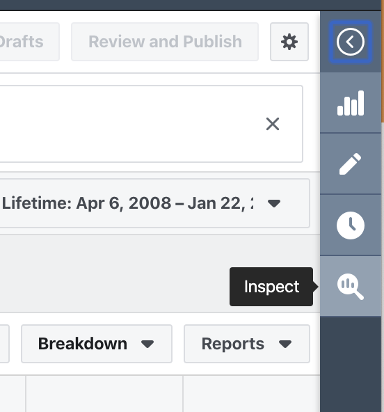
That will open the Inspect Tool’s various charts and graphs. This information can help you diagnose issues related to auction competition, audience overlap, ad fatigue, and more.
Note that, as of this moment, the Inspect Tool is only available for the following objectives:
- Traffic
- App Installs
- Lead Generation
- Conversions
It also isn’t available for the following:
- Dynamic Ads
- Dynamic Creative Optimization
- Split and Lift Test
Let’s take a closer look at what you can find here.
Auction Competition
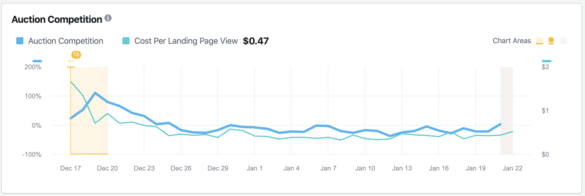
Facebook ads are distributed based on an auction system. If multiple advertisers want to reach the same person, an automated auction determines which ad that person sees.
Greater competition will lead to higher costs to reach people. While your conversion rates may be fine in these cases, the high competition may result in an unprofitable cost per conversion.
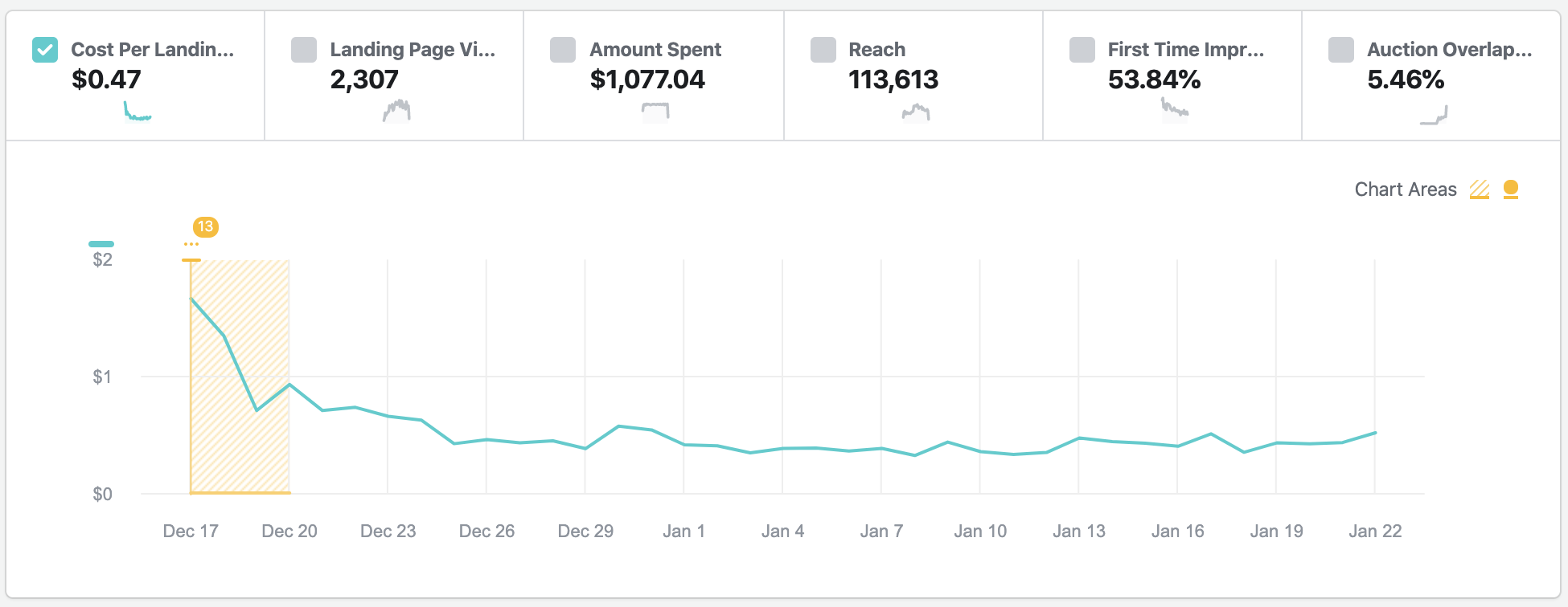
The chart above represents whether competition is at, above, or below average levels. Facebook considers anything over 20-percent to be high competition.
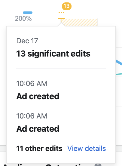
The yellow shaded area at the left of the chart represents when the ad set was in the learning phase. The number 13 represents the number of significant edits during that phase. If you hover over that, you’ll get details.
This chart compares competition levels to your Cost Per Action (whatever action you are optimizing for) to help see if there is a correlation. As you can see in this example, competition and cost per action were highest while in the learning phase.
This is a very good example of why you should allow your ad set to exit the learning phase prior to turning it off due to poor performance.
Audience Saturation
The Audience Saturation chart helps you recognize if ad fatigue is contributing to a drop in performance.
The primary view compares your Cost Per Action to frequency over time.
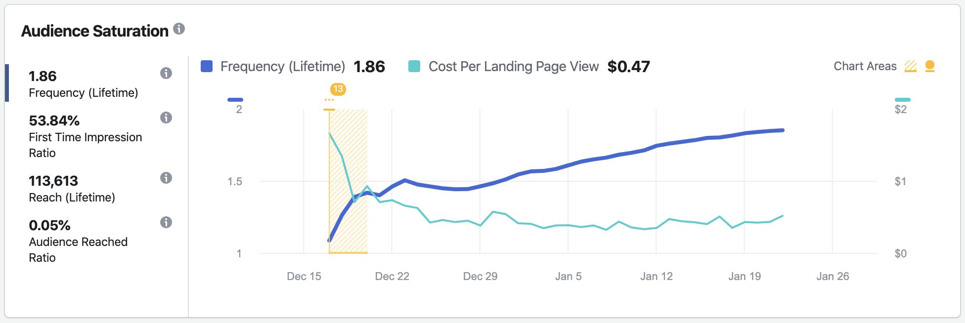
According to this chart, there is no clear correlation between frequency and Cost Per Action. This is likely because the audience is large, resulting in a very controlled frequency.
You can also view First Time Impression Ratio as it compares to Cost Per Action.
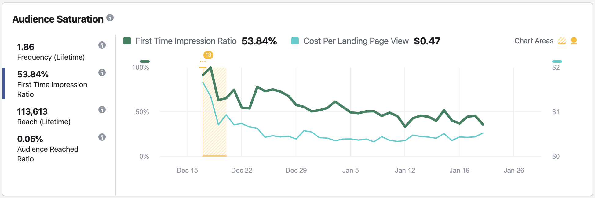
This shows the percentage of people seeing this ad for the first time on a daily basis. In this example, the ratio dropped early on, but stayed around 50% during the lifetime of the ad set. This is consistent with the low frequency we saw.
You can also get a sense of how Reach evolved over time.
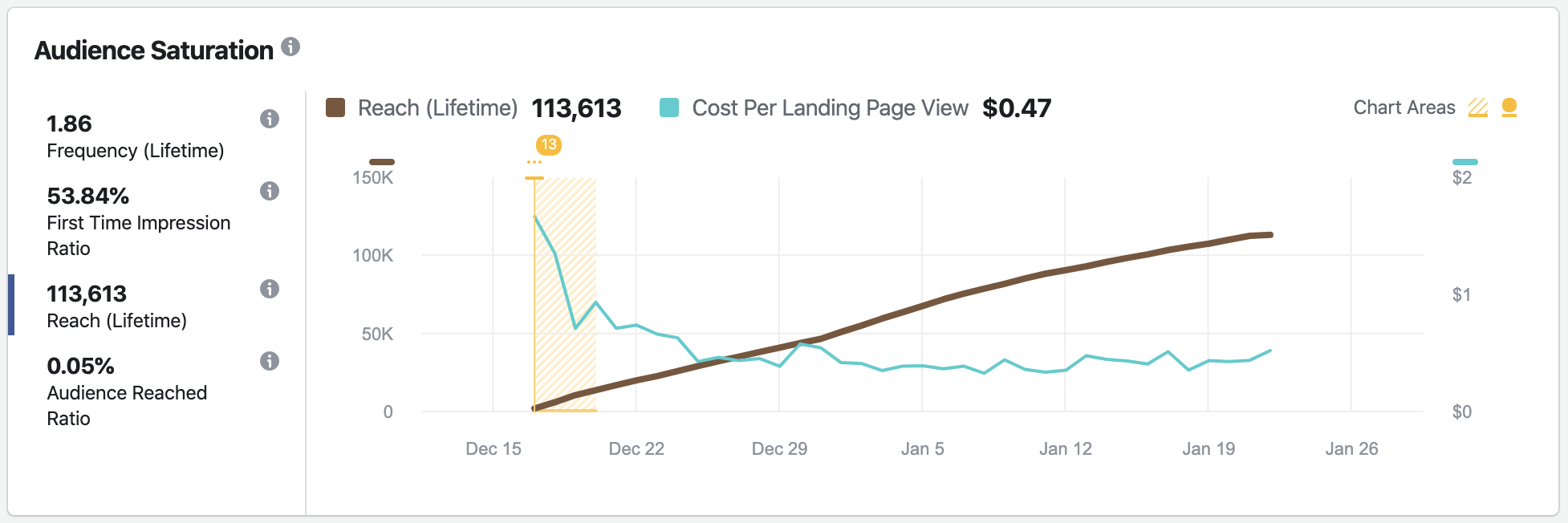
Reach is increasing at a constant rate, again suggesting that the audience isn’t saturated. If it were, the line would start flattening out.
The Audience Reached Ratio shows the percentage of your potential audience that you’ve reached so far.
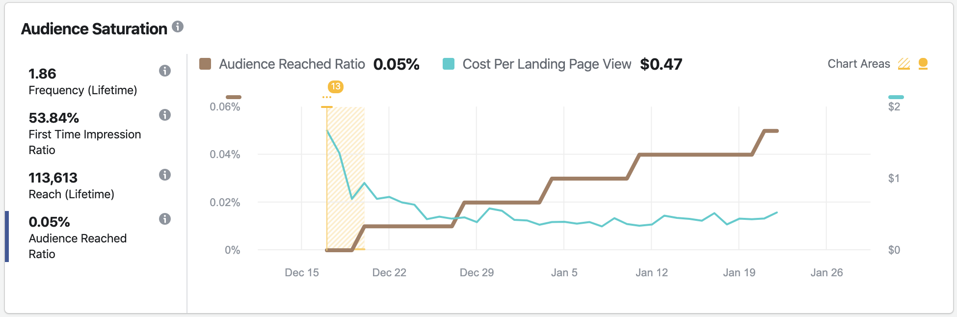
In this example, you can see that this ratio is very low — well under 1-percent. This again suggests that ad fatigue is not setting in. We could safely run this ad set longer or even increase the budget.
Auction Overlap
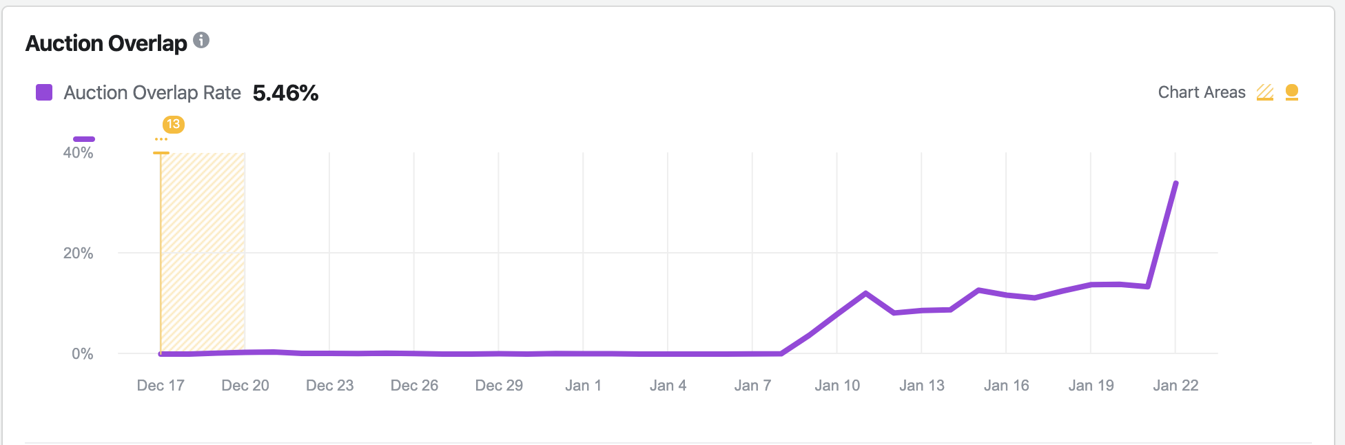
If you are running multiple ad sets that reach the same people, you may be competing against yourself. Auction Overlap represents how often this happens within the same ad account.
Auction Overlap doesn’t only happen when you target the same audience in multiple ad sets. Understand that some of the same people can be in different audiences. For example, I’d expect to find significant overlap between my Website Custom Audiences, email list audience, and Facebook page audience.
A little bit of overlap isn’t a bad thing. In this example, there was virtually no overlap until after January 7. It ultimately spiked today, as I type this. I started a couple of new campaigns yesterday that are surely the reason for this. Will the performance suffer as a result? We will see!
If you click the link to “Show additional insights,” you’ll get a list of ad sets with the most auction overlap. At that point, you may decide to turn one or more ad sets off to help improve performance.
Significant Edit History
At the very bottom is a list representing this ad set’s significant edit history.
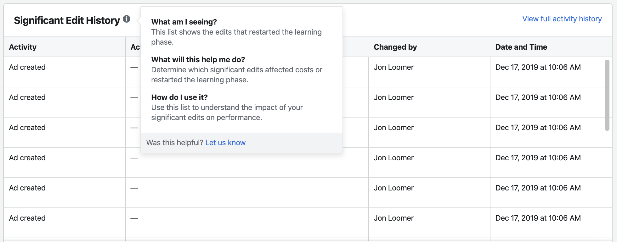
Edits will only appear on this list if they resulted in restarting the Learning Phase. This can help you understand whether such edits were necessary and what to avoid in the future.
Overview
At the very top is a chart that represents the following over time:
- Cost Per Action
- Number of Optimized Actions
- Amount Spent
- Reach
- First Time Impression Ratio
- Auction Overlap Rate
You can chart these individually or all at the same time. Simply check the box next to the data you want to see.
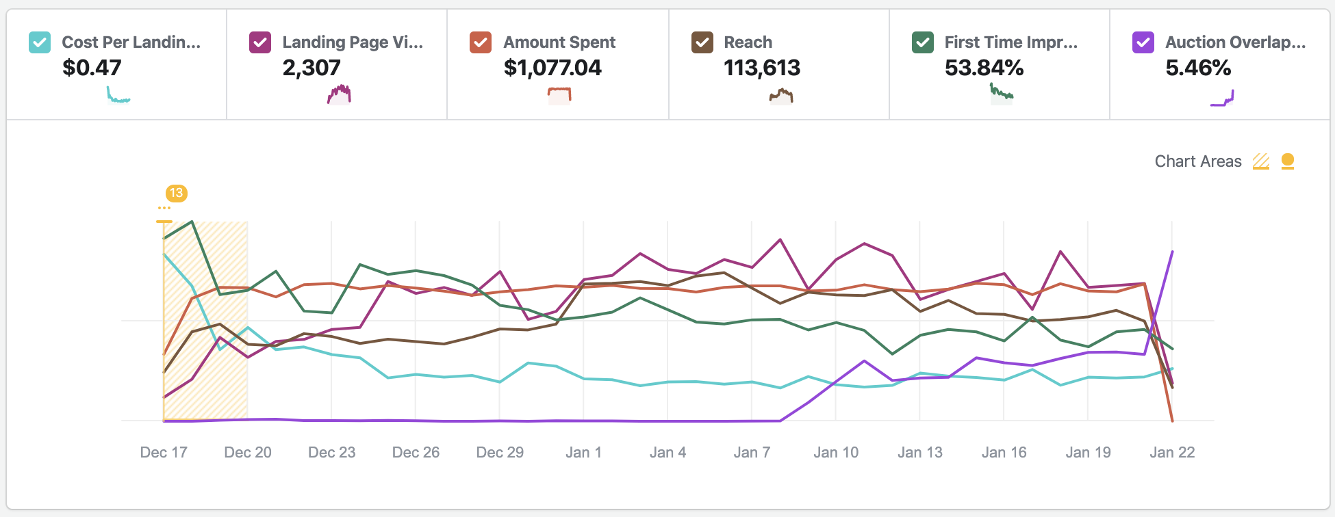
If you’re seeing a drop in performance, this might help isolate the contributing factors.
Your Turn
Have you been using the Inspect Tool? What do you think?
Let me know in the comments below!