Any screenshots and details of functionality may no longer be relevant. Below are some related posts that are more current:
- Hands-On With Push Delivery to This Ad (Jun 9, 2026)
- Website and Instant Forms Confusion (May 31, 2026)
- New Creative Workflow Replaces Flexible Format (May 3, 2026)
First of all, Facebook’s 20% rule that applies to the amount of text that can appear within images of News Feed ads is stupid. It’s poorly enforced. It’s inconsistent. It’s ridiculous that it applies to link thumbnail images.
Did I mention that I hate it?
Lately, most of my ads are getting through. Not all of them. But most. Unfortunately, this doesn’t appear to be the case for most (as you’ll see from the comments under this status update):
One of Facebook’s issues is that they appear to approve most of these ads, but then later reject them. So if you’re looking to run an ad for a short time anyway (which has been the case for many of my ads that seem to slip through the cracks), you may skate by.
But I noticed something else recently that’s more than a bit annoying. The amount of text often doesn’t matter. It all depends on the placement of that text.
The Evil Grid
Recently, I started a campaign that initially consisted of two ads. Both were link shares that used thumbnails that measured 400×209 to make use of the new, awesomely big real estate in desktop News Feed.
Those ads used two different images. Here they are:


The two ads are nearly identical, barring some color differences. But guess what? Facebook rejected one of the ads — the orange one.
The reason? The 20% rule.
First of all, it’s pretty ridiculous that one made it through and one didn’t. And that ad with the gray image is still running a week later.
But when Facebook rejected that orange image, I was directed to their Grid Tool.
Upon uploading my orange image into the Grid Tool, that image was then displayed with 25 boxes over it. I was instructed to select the boxes that contained text.
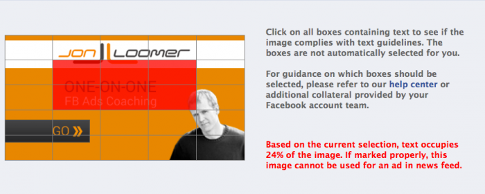
I wasn’t sure if my logo qualified as text (or the “GO” button for that matter), but I assume it doesn’t. Even without the logo, the text I used spilled over into six boxes. Facebook claims that means my image was (at least) 24% text.
But I quickly realized the text could be moved to fit snuggly within those boxes. So I moved the text — the size and everything else remained exactly the same — and tried again.
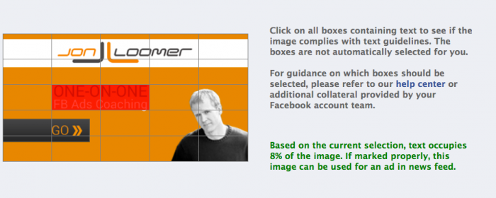
Note that a sliver of the “g” in “Coaching” spills over into one box. Even if I were to count that box as well as the “GO” box, it would mean that my ad is now 20% text exactly.
So I resubmitted my ad. What do you know? It was accepted.
Get Frustrated or Use the Grid Tool
When you think about it, there is no true way to measure the percentage of text in an image. Since letters aren’t blocks, there will always be white space in between.
This is why using a grid is so inexact. It doesn’t really measure 20% text at all. It just measures whether there is some text within 20% of the squares within an arbitrary grid.
So, yes, it’s an insanely stupid rule. But you have two choices here:
- Ignore the rule, cross your fingers and get frustrated when your ads get rejected; or
- Use the Grid Tool to make sure that your text is in the right place.
I recommend #2. Be conscious of the amount of text within your image. Before you submit your ad, make sure that text is placed properly when you use the Grid Tool.
Your Turn
How about you? What are your experiences with the 20% rule? Let me know in the comments below!