Branding and traffic are at the core of a publisher’s goals. I want a potential reader to spot and recognize my branding wherever they are, making them more likely to click and go to my website.
Facebook now allows publishers to upload logos within the new “Brand Identity” section of a page’s Publishing Tools to improve branding on the platform. The testing grounds for where these logos will be surfaced are within Search and Trending.
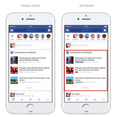
Here’s an example of the old and new versions of Trending (old on the left, new on the right) to show how this changes branding on mobile…
And here’s an example of the updates to Search…
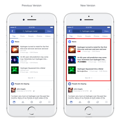
These changes will apply to both desktop and mobile, and it’s likely that we will see more of this branding in the future.
From Facebook:
Our goal is to put your logo next to your content wherever it appears in Facebook. To start, we are testing how these logos work in Trending and Search surfaces on Facebook. We will continue to explore opportunities to add logos to new surfaces and further extend publisher brands on Facebook.
This appears to be a display update that not all users are seeing yet (I don’t yet have it). However, you shouldn’t wait for that update to upload your own logo into your Brand Asset Library.
How to Add Your Publisher Logos
Facebook has added a new section called Brand Identity to the page Publishing Tools. This is where you’ll add your logos.
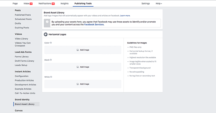
[Note that I don’t have this yet on all of my accounts. There’s no indication of when it will be available to all.]
You’ll need to upload three different horizontal logos:
- Color (for white backgrounds)
- Black (for contrast against light backgrounds)
- White (for contrast against dark backgrounds)
Here’s an example of my logos…
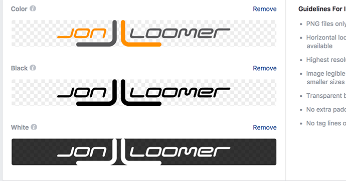
Brand Identity Logo Requirements
Here are a few requirements to keep in mind…
1. Horizontal logos for best results, not exceeding a 1:10 ratio. In other words, the width can’t be more than 10 times the height.
Either of these would be fine:

2. Square is okay. The main thing is that you don’t use a vertical logo.

3. No taglines or secondary text. The logo will be small in most cases, so this secondary text won’t be legible.

4. Remove extra padding around your logo. Extra padding (top, bottom, and sides) can make for an awkward placement.

5. PNG files only with a transparent background. No colors or opaque colors behind the logo.
Note that the white version does have a transparent background. Facebook shows it having a black background after uploading only for display purposes so that you can see a logo is there.
6. A height of 300 pixels or more is recommended. Use the highest resolution file possible for scaling purposes.
7. No colors or gray tones in the black and white versions. Use #000 for black and #fff for white only.
Your Turn
I’ve added my logo for the Jon Loomer Digital page, though I’m waiting to see its application across Facebook. Do you have this yet? Have you added logos to your Brand Asset Library?
Let me know in the comments below!

