


The problem with most Meta ad creation strategies is that they assume a universal template that can work for anyone. That doesn’t exist.
But what does exist is a collection of fundamental principles that you should follow. While satisfying each principle won’t guarantee results, the failure to satisfy them will make high performance less likely.
This should be your checklist when creating ads…
1. Multiple Formats
Do not lean entirely into one ad format. I don’t care if “videos tend to be most effective.” Ad creation and distribution work differently now. Create different formats so that Meta can show the right version to the right person in the right placement.
Not everyone responds at the same rate to a static image, just as not everyone engages with videos. If you eliminate a format, you also eliminate a segment of potential customers.
Whether you provide multiple formats for a single ad using the multimedia experience (also known as the new creative workflow) or create separate ads for different formats doesn’t matter a whole lot. And while you should consider carousels, your main priority should be having both static image and video options.
2. Maximize Placements
If you’re using a performance goal that maximizes the number or value of conversions, you should almost always leverage all placements with Advantage+ Placements. As a result, we should be thinking about how our ads look in each of the available placements.
This is one of a group of common mistakes advertisers make. They envision their ad as it would appear in a single placement, usually feeds or reels. That could mean removing placements that they shouldn’t, but it’s otherwise neglecting the possible optimization of placements your ads could be shown in.
When you submit your creative variations, do so with your sights beyond a single placement. You want to maximize performance across multiple placements, not just one or two.
3. Appropriate Aspect Ratios
It’s important to remember that your image or video is going to look different depending on the placement. Feeds are typically square or 4×5 while reels and stories are best at 9×16.
When creating ads using the single media experience, you can provide up to three versions of a single ad. Meta asks for square, vertical, and horizontal.
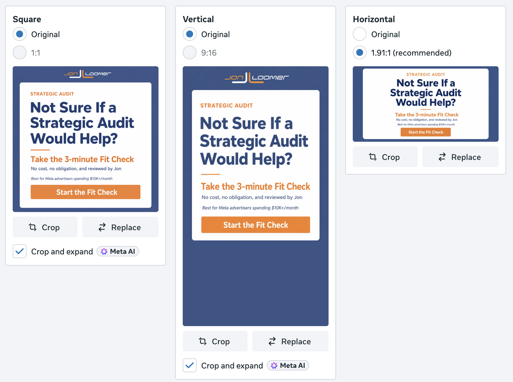
You can also customize creative by placement to make sure that square or 4×5 creative is in the feeds, 9×16 in reels and stories, and square or horizontal in right column and search results.
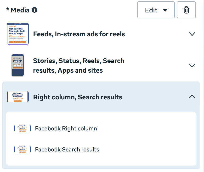
There are almost always a few stray placements that are best as square when those grouped around them are vertical (typically Ads on Facebook Reels and Marketplace, and you can spot the problem when previewing ads).
If you create ads in the multimedia experience, you can provide multiple images and videos of different sizes. You’re then able to customize which placements each version appears in to maximize your creative’s dimensions (you may need to ungroup them first).
Here’s an example of a 9×16 image that only has stories and reels placements selected…
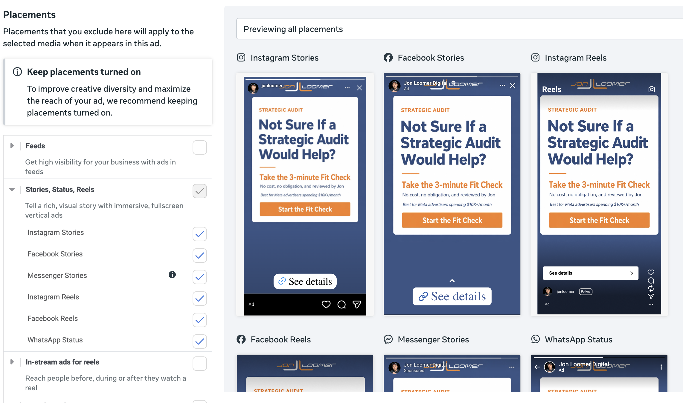
While you certainly can have square and 4×5 creative work on tall placements, it’s often better to create images and videos that are specifically for them. Make sure that nothing important is in the bottom third of tall creative since it can be covered with text.
You can also provide tall images that get cropped automatically for placements other than stories and reels. You have to make these carefully since an imperfect crop could result in a bad-looking ad.
4. Maximize Text Options
When you create an ad, most advertisers are focused on a single combination of ad copy and creative. But that’s no longer best practice. The goal now should be to provide multiple versions of copy and creative so that Meta can mix and match them to show the right combination to the right people.
This isn’t about split testing. We have to get out of the mindset of finding the “winning” copy. This is about providing options so we don’t limit ourselves.
You have the ability to provide up to five primary text and headline options. Use them.
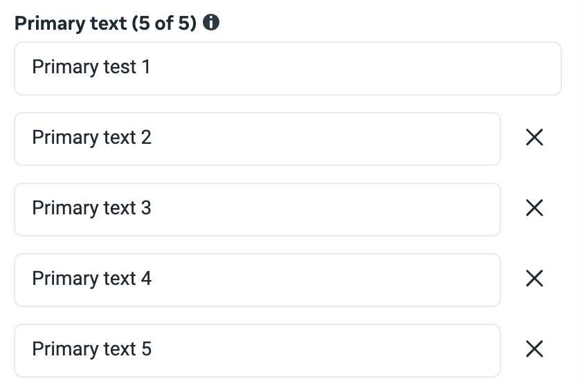
When you leverage these options, don’t simply provide minor variations of the first text. Make them all uniquely different. Experiment with short and long text.
The main thing to remember is that you should have important text early in the copy since it will be truncated after one to three lines, depending on the placement. So you want to grab attention with those first few words.
5. Use Sales Psychology
Understand that there isn’t a single template you can follow for “good” or “bad” text in an ad, or “good” and “bad” ads, for that matter. But an important element to give you a leg up is using sales psychology in your copy.
I’m not going to claim to be an expert in sales psychology. I’m not. In fact, for years, I created ads that performed well in spite of the fact that I did a poor job of leveraging the power of words and emotion.
The best way I can help you is by sharing my mistake, which is a common one. My copy focused almost entirely on function: What the thing is and what it does.
And this is where we as advertisers can get lost in the details. We think that we need to pack all of the features and benefits of the thing we’re promoting into an ad. The list could be full of industry jargon and overall nonsense. It’s cold language that doesn’t resonate with people.
Good sales copy starts with customer personas. Who are your primary customers? There are likely multiple segments. How old are they? Where do they live? Are they in the city, rural, or small towns? Are they men or women? What jobs do they have? How much money do they make? What is a typical day like for them? How do they speak?
There are some very basic personas that I focus on for my business:
- Advertising consultants and small agency owners
- Large agency owners and media buyers
- Small business owners who run ads for themselves
- Advertisers working as employees for larger companies
From there, think about a persona’s pain points. If you were to ask them, what are their biggest challenges? Annoyances? Frustrations? Problems? Consider the things that cause pain and hardship that are especially common for this group.
What is it about your product that can be the solution to these pain points? How can it solve that problem? And how will it make them feel when that problem is solved?
You’re selling with emotional connection rather than a list of features. It’s much more effective.
Of course, there are many ways to accomplish the same thing. You can use testimonials and stories. It could be a video or a static image. A demo of how your product solves exactly the problem they have. Big, bold text that is brief and to the point.
Each ad should leverage a different persona, and probably a different pain point and solution. All five primary text and headline options need to work together with whatever images and videos you provide for an ad. They will just be different ways to convey the same message.
6. Prioritize Uniqueness
You’ve heard this phrase over and over since Andromeda entered the advertising vocabulary: Creative diversification.
Live it. Whether you’re creating one ad or a dozen, you should create them in the spirit of creative diversity. What I mean by that is that you should prioritize providing uniquely different formats, visuals, text, and angles across your ads.
Gone are the days when we’d create multiple ads that all used the same text but different creative (or vice versa). Your second ad should look and feel completely different from the first.
Previously I discussed potentially creating separate ads for different customer personas, formats, and combinations of pain points and solutions. Some of these things can be combined into a single ad, but not always when the various assets you provide need to work together.
But when you do create separate ads for a different format, for example, start fresh with the text. Do not copy over the text you used in the other ad. And if you create a separate ad for a different pain point under the same customer persona, draft unique copy and creative.
It’s a lot of work, I know, and I can’t claim to never take any shortcuts here. But you should prioritize uniqueness.
7. AI-Generated Text and Creative
When it comes to providing diverse creative, do not ignore Meta’s AI-generated options. Before you roll your eyes, Meta’s output in this area is far better than it was previously.
After you provide text options, Meta now automatically generates several more with AI, including both new images and copy.
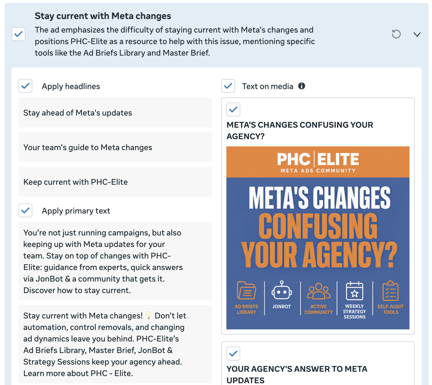
In the example above, the original image featured text on it. Meta then worked up a different angle, including rewriting the text that appears on the image.
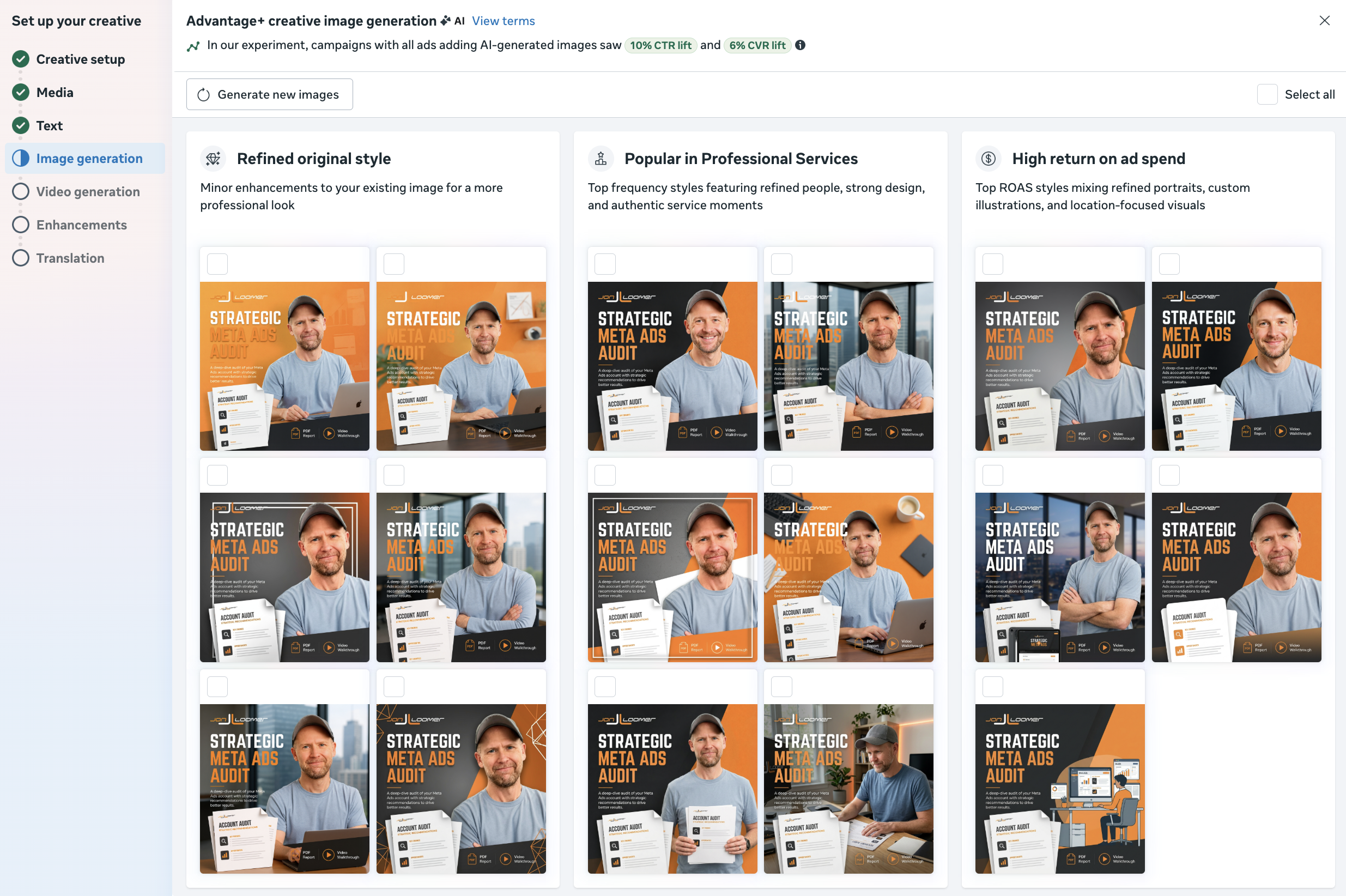
Meta also has a step to generate AI images inspired by your creative.
And finally, you can have Meta generate videos using different angles, themes, and static images as the inspiration.

While you shouldn’t blindly accept any of the AI-generated text, images, or videos, all of them have improved significantly in quality during the past year. Do not give up on them, particularly when variety and uniqueness can be so valuable.
8. Accept Relevant Enhancements
I’m going to lump in every checkbox and option found when creating an ad into the same category. It’s all of the stuff that many advertisers will routinely turn off.
I’m not saying you should turn them all on. I just wouldn’t reflexively turn them off. Balance the risk for each account, because I realize that some clients are much more sensitive than others. But otherwise, I wouldn’t turn everything off without a clear reason. Here are a few examples…
Multi-advertiser ads. This allows Meta to display your ads in an ad unit with others, under a related product. But the same unit can then appear below your ad if you keep it on.
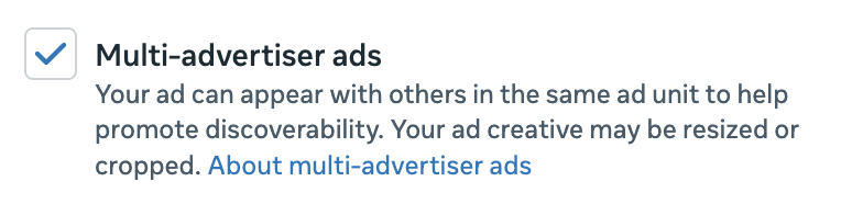
It is impossible to prove how often the multi-advertiser ads unit is used and the impact it has. But I operate from the general understanding that Meta wants me to get good results. So if something hurts results, it will be used less. I keep it on.
Extensions, branding, site links, website highlights, and products. These options all appear during the creative setup. Make sure you define your branding since it can be applied to enhancements that Meta uses.
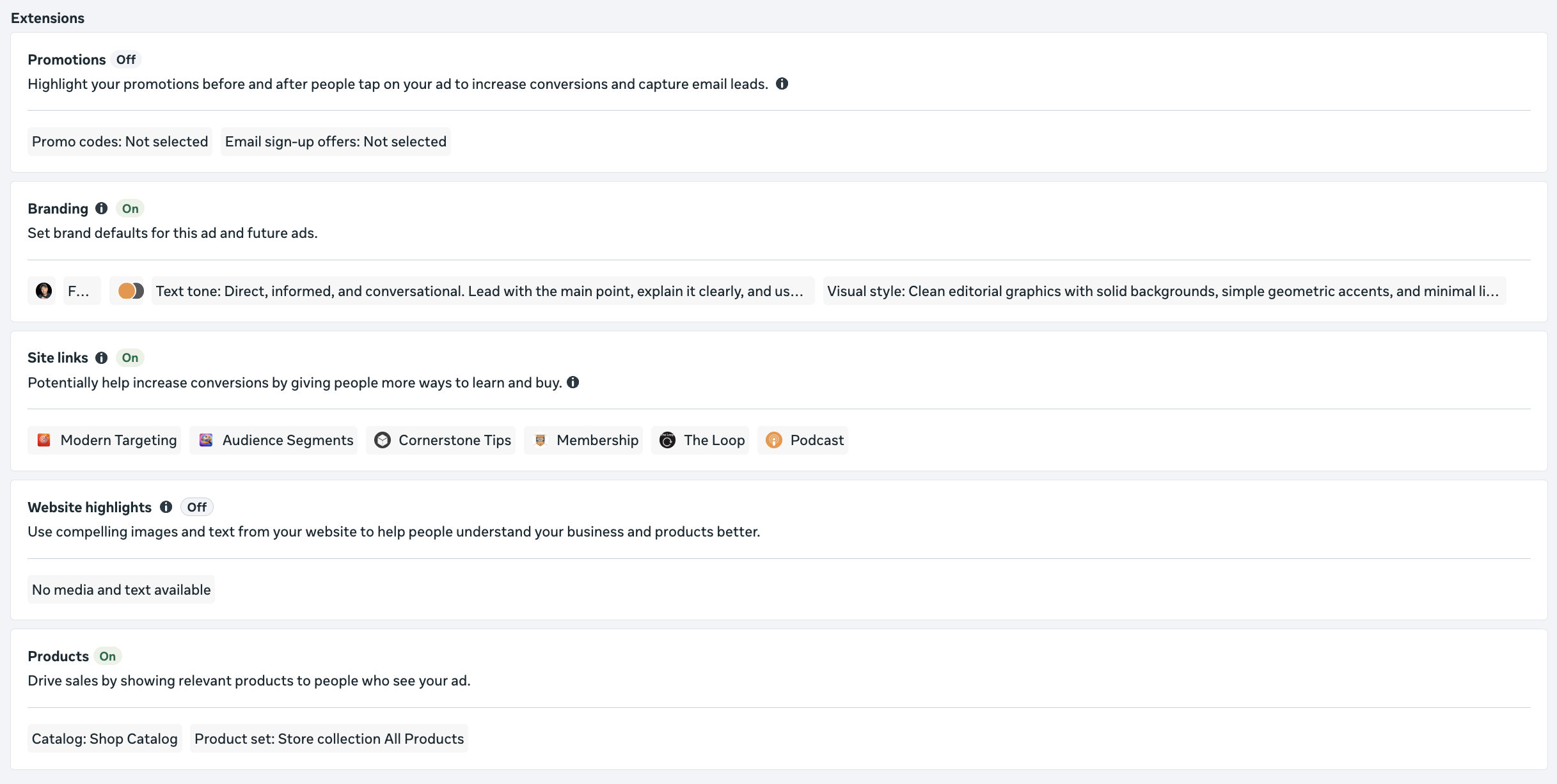
I customize my site links and usually leave them on. I will leave extensions, website highlights, and products if they are relevant.
Personalized destinations. This includes optimize website destination, product browsing, and browser add-ons.
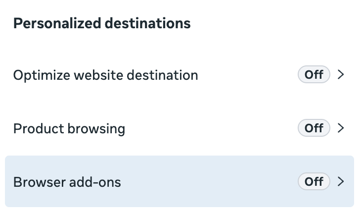
I tend to turn these off, but mainly because I don’t find them relevant. I don’t understand allowing Meta to send someone to a different page of my website than the one I designate (optimize website destination). I will only turn on product browsing if there’s a product catalog to promote. And I believe including a browser add-on for call, Messenger, WhatsApp, or instant form just adds unnecessary noise for most situations.
Format display options. This is where you can have Meta generate options for single media, collection, and carousel. It’s easy to forget about these since the option to turn it off is hidden. It pulls from your site links and product catalog to generate these versions. Just make sure to review it before deciding whether you want to keep it on.
Advantage+ Creative and essential enhancements. Look, there are a lot of them, and it’s not always easy to keep track of Meta’s latest enhancements. Most advertisers hate them and will reflexively turn them all off.
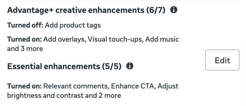
When there are examples of how the enhancement behaves, review it before automatically turning it off. Some of them can be customized. I tend to leave most of these on, even though I know most advertisers don’t. In theory, they shouldn’t hurt you.
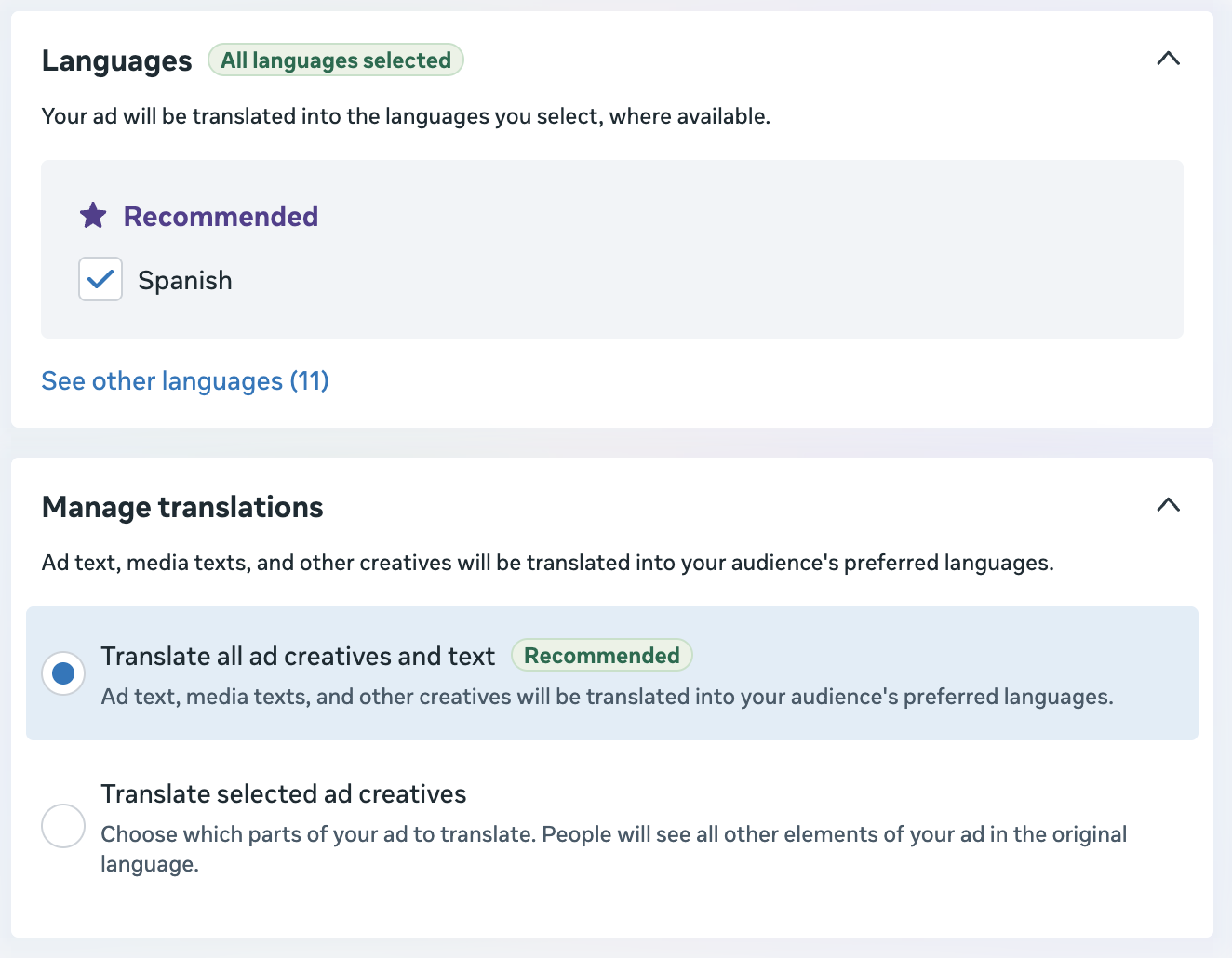
Advantage+ Creative text translation. Consider your audience first, of course. I tend to leave these on.
Always other stuff. Meta’s constantly rolling out something new, so this section can’t possibly name every possible enhancement. But I also see options like Prompts and Responses and Interactive Experiences.
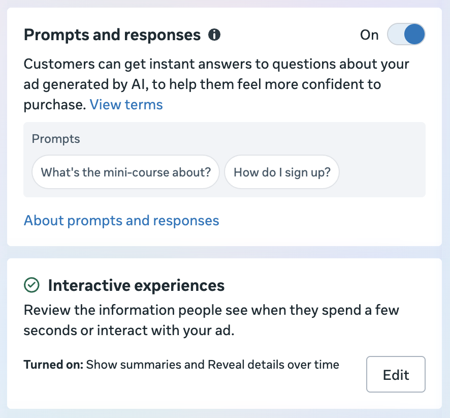
Everyone has their own appetite for risk, and that’s what many of these features are. In most cases, I’m not overly concerned about them unless there’s an obvious reason I want to turn them off.
I won’t say that you’re hurting results by turning these off, but you may be missing some opportunities to generate variations of your ads. The range of results with each enhancement is likely negligible, and it’s nearly impossible to prove one way or another.
I also wouldn’t say that you should do what I do and leave them all on. I just encourage you to think through each option and make customizations before deciding to reject these options entirely.
9. Drive to an Effective Landing Page
While this might not technically fall under the category of what we’d tend to lump into the steps of ad creation, the link to the landing page is one of the most important elements. You could craft the perfect set of ads, but get terrible performance due to a broken landing page.
Consider the following:
Load time. How long does it take to load the page? If it takes too long, potential customers will abandon your website before they get a chance to buy.
Usability and performance. Does the website work? This is not only whether the page itself loads, but whether each required click is functional and necessary. You don’t want to make a checkout process too complicated, and you don’t want to frustrate the visitor with unclear steps.
Relevance. Are you sending people from an ad for a specific product to a category page or home page? Or a landing page for the specific product they were hoping to buy?
Ownership. Does the ad send people to a landing page template under a Leadpages or similar domain? Or does the domain match the company you’re buying from? This impacts trust.
Cleanliness and design. A well-designed page that looks professionally done inspires more trust than one that looks thrown together by a random somebody on a Tuesday.
Branding. The colors, fonts, and styles are consistent with what you’d expect from the brand, assuming they were previously established.
Messaging consistency. While it’s not always reasonable to create a custom landing page for each ad, you should consider it for a set of ads. If you lean heavily into a pain point or feature as a solution, highlight that same messaging on the landing page. It can also help to use creative on the landing page that is consistent with what was featured in the ad.
10. Preview First
It’s a simple step, but do not skip it. Before publishing your ad, use the advanced preview to see how your ad appears in each placement.
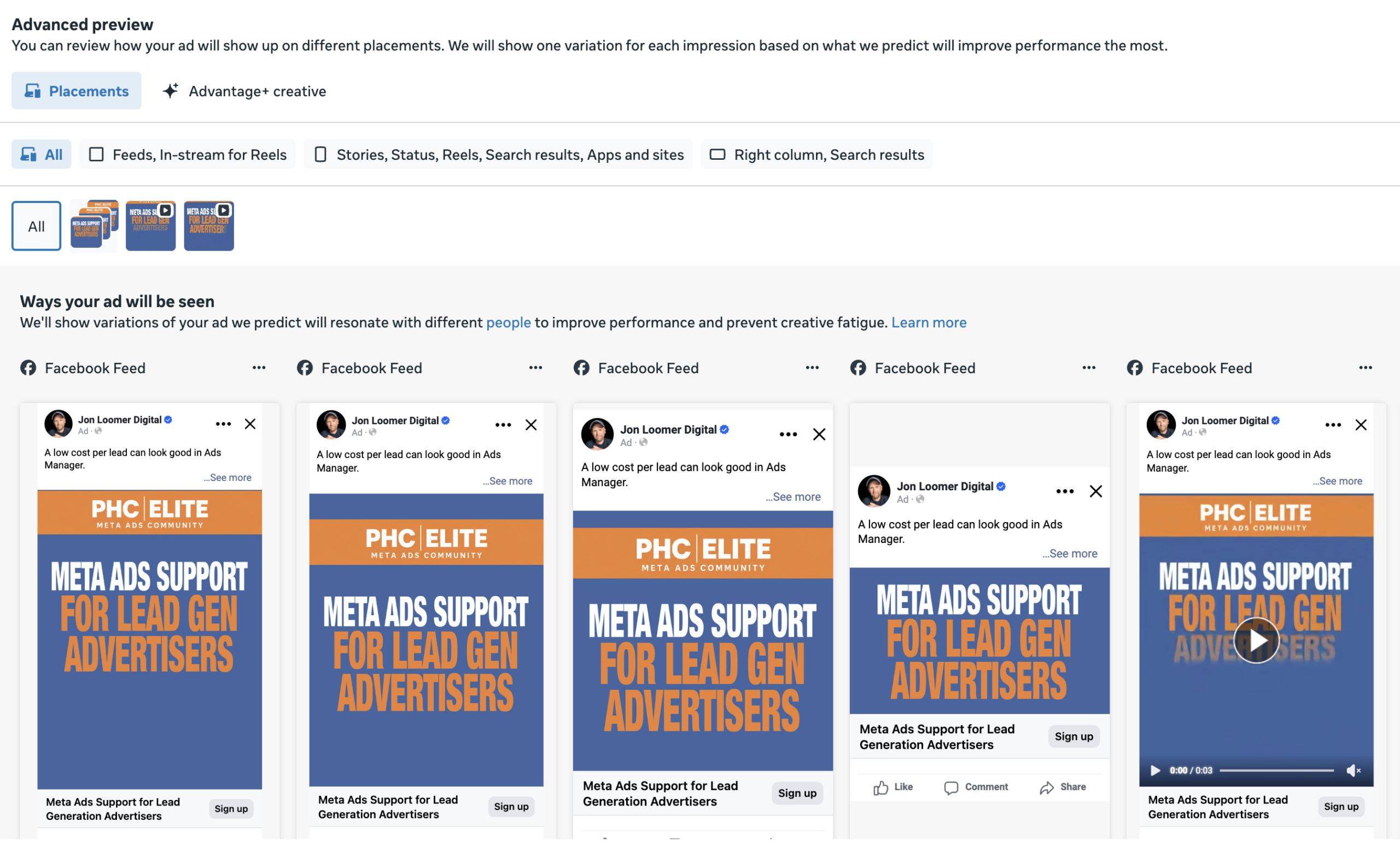
This is where I’ll often spot problems with crops. You may need to go in and manually customize individual placements. Don’t publish until everything looks the way you want it to look.
11. Add URL Parameters for Tracking
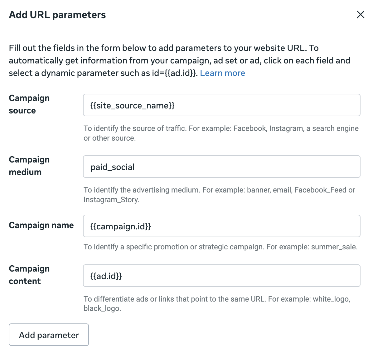
Don’t forget to add URL parameters for third-party tracking. This appears at the bottom of ad creation.
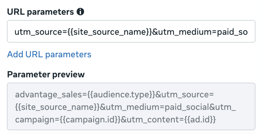
I like to use dynamic parameters that will automatically pull information like the campaign and ad ID.
12. Evaluate Performance in Aggregate
Once you’re done, take a deep breath and relax. Sit back and wait for results to come in.
Seriously, I’m not kidding. Relax. Stop hyper-fixating on how each ad does. I’m not saying you should completely ignore which ad, creative, and copy do best, but they shouldn’t motivate your every action.
Something I want you to get into the habit of if you haven’t already is this: Evaluate results in aggregate. In this case, that means focusing more on how your ad set is doing than individual ads.
This makes more sense once you accept your role when creating ads. Your job is to provide countless variations of assets that Meta can mix and match to show to the right person at the right time in the right placement. That’s why text variations, unique visuals, and format diversity are all important. You aren’t micromanaging this bad boy anymore.
And if you aren’t getting the results you want from your ad set, it means that the ads you’ve created are not good enough. Create more ads and publish them to the existing ad set.
Your Turn
Anything else you’d add to this list?
Let me know in the comments below!