Advertisers have long flown blind on CTA buttons. It makes sense that “Learn More” might drive more clicks while “Shop Now” would drive more intent. But it’s also never been clear how much these CTA buttons matter.
Finally, we might have some helpful information. You may have seen the following message recently when creating an ad in Ads Manager:
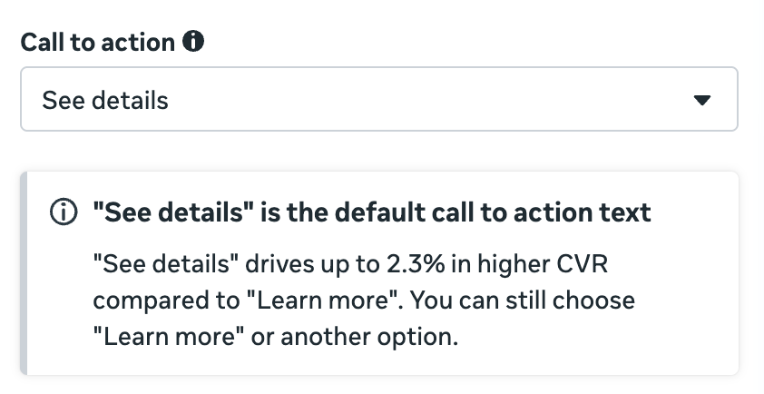
‘See details’ is the default call to action text. ‘See details’ drives up to 2.3% higher CVR compared to ‘Learn more.’
What does this mean for advertisers’ use of CTA buttons?
What it Means
While a difference in performance between CTA buttons makes sense intuitively, I’ve long questioned whether that difference is significant or predictable. And this message from Meta makes that especially questionable.
Meta’s highlighting that “See details” drives up to a 2.3% higher conversion rate than “Learn More”? UP TO 2.3%.
It tells me that the difference is negligible and not worth obsessing over. Don’t worry about split testing CTA buttons unless you have the budget that could highlight meaningful differences. Any variances are likely to fall within a range of randomness.
What About Other CTA Buttons?
It’s interesting that Meta believes the difference in performance is enough to make “See details” the new default. I only wish that Meta would share data on all of the CTA buttons to give us more to work with. They have the data on “Shop Now,” “Sign Up,” and more.
Why not share it?