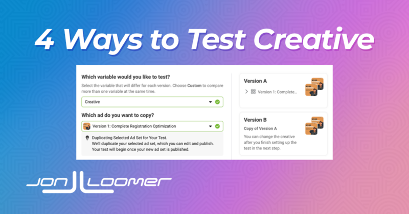
4 Ways to Approach Creative Testing with Meta Advertising
How should you approach creative testing? Well, it depends on the situation, what you care about, and what you’re trying to accomplish…
This is where advanced Meta advertisers go to sharpen their skills and stay on top of the constantly evolving world of advertising. It’s also where inexperienced advertisers go to become advanced.
How should you approach creative testing? Well, it depends on the situation, what you care about, and what you’re trying to accomplish…
Meta’s campaign construction flow is unnecessary cluttered and complex. This is a proposal for how it could be simplified and improved.
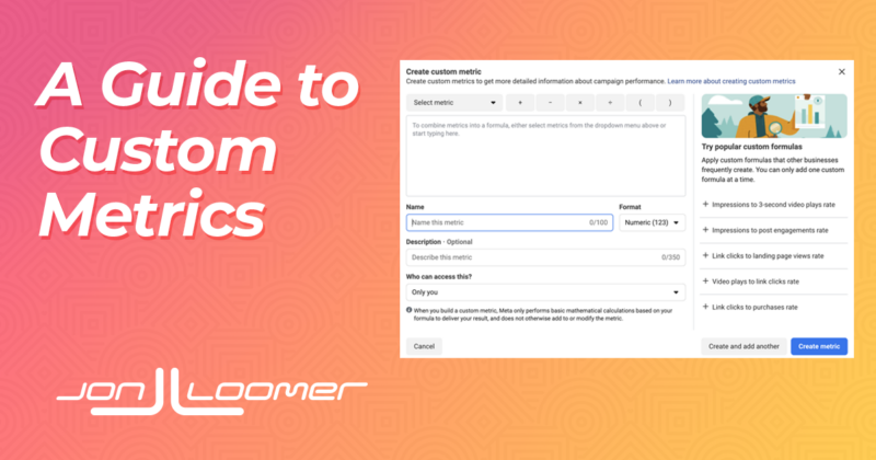
Custom metrics are a great way to create metrics that are unique to your performance measurement through the use of formulas. Here’s how…
This is a collection of 27 total cornerstone Meta advertising guides on 16 critical topics. You can’t read this in one sitting. Bookmark it!
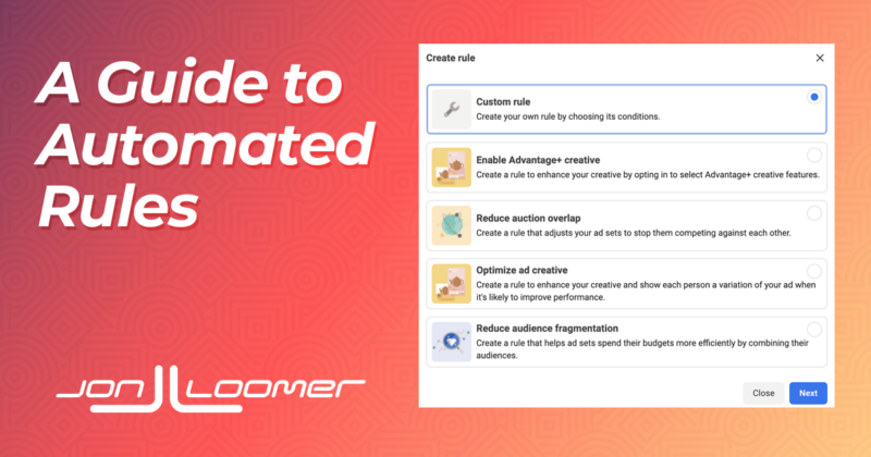
Use Automated Rules to automatically apply changes to your advertising to improve performance and increase efficiency. Here’s how…
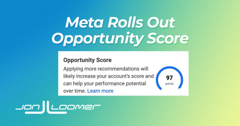
Meta is rolling out Opportunity Score to Ads Manager, which represents how optimized your campaigns, ad sets and ads are. Here’s how it works.
While I have a paid community who have access to my countless premium resources, I also create free content for those on a budget or getting exposed to me for the first time.

Facebook ads and entrepreneurship challenges discussed over a beer. Full Pubcast episodes are published every Friday, and short Pubcast Shots on all other days. Pop a bottle...
Use our tool to dynamically create the relevant pixel code based on your criteria.
Browse our FAQ for answers to many of the common questions advertisers like you are asking.
The Power Hitters Club is a community of hundreds of advertisers with extensive experience in Facebook Marketing. Those who are serious about maintaining their sharp skills with Facebook ads join the PHC. We support one another, share strategies and case studies, and alert one another of new features and how to use them.


I make sure that we focus on developing and expanding value creation and innovation. This means that we are always thinking about how to better serve our members. I stay curious about how to make things better and easier for all stakeholders. And I make sure Jon is encouraged, supported, and challenged so that we have a business that is productive, profitable, and most importantly, that we are proud of.

I write content for Jon’s site (which you can check out here), and I engage with advertisers in our Power Hitters Club communities to dive deeper on issues related to Facebook and Instagram ads.
I oversee Jon’s Power Hitters Club membership process and relations, identifying potential and existing member needs as well as responding to membership queries. I also collaborate with other team members to optimize the customer journey experience.

Myself and my team help Jon with all matters relating to the websites (design & development), WordPress, and integration. We’re also very interested in areas such as online privacy, & Facebook Conversions API etc.
I have followed Jon Loomer loosely for a few years online, dipping into his free trainings and resources as they popped up on my newsfeed or appeared in my online searches. I signed up for Jon’s email list and messaged his team multiple times feeling out the content and attitude behind the Power Hitters Club. I found the quality and quantity of information very transparent and informative.
Since I have been involved with PHC I have found a group of like-minded advertisers and agency owners who actively share with and support each other in an ever-changing industry. Jon & Luke are approachable and professional in their approach to real time education regarding Facebook and Facebooks ecosystem.
I have learnt some valuable lessons and have had my eyes opened wider to this industry since being a part of PHC with not only the library of trainings, Live chats, One on ones but most importantly with the assistance Jon/Luke and the collective of the people in the Facebook Group.
If you are an agency owner or Facebook advertiser and you are looking for a training and support network I strongly suggest look further into PHC and Jon Loomer as this is the best I have found.
Business Manager is constantly changing and it can be hard to keep up, PHC - Basic ensures you are always up to date on a weekly basis which ensures your campaigns are performing to the best of their ability. I've benefitted from being able to get feedback from other marketers on campaign & audiences ideas before testing them out.
I love PHC - Basic because it makes me feel safe. It is very important that I can ask a question about social media at the exact time I face the problem and get an immediate response from people who know what they say! I also get informed on new tools coming and I get new ideas for my advertising projects.
As a novice Facebook advertiser and an sole in-house marketer, I knew I didn’t need the elite group but I did need the right support to grow. I have been in the group only for a month but I have had many of my burning questions answered and the support I have needed to develop my advertising skills. I would highly recommend the Power Hitters Club- Basic to any noise who seeks development. But remember to be engaged.. you only get out what you put in.
I've been a Power Hitter Club member for about 6 years now. When I first started, I was new to the industry and I was launching Facebook Ads within our company. When I found PHC, I loved the no-nonsense deep dive into robust Facebook marketing strategies. It seemed overwhelming at first but Jon's approach to training is perfectly guided for beginners right up to expert-level training. Over the years I have been supported consistently with sound advice, useable strategies that have been tested and proven! I also really like being a part of a community of people who face the same challenge and are happy to collaborate! Fast forward to today and I am now the VP of our agency and even though I can't make every live strategy session, the resources and knowledge needed to be a high knowledge marker are always accessible for review when the time is right for me and my team. This membership has been the best investment for my career and I highly recommend this to anyone serious about Facebook marketing.
I have seen the most successful people in ecommerce, agency, or brand ownership, are those that have one thing in common: always learning and never taking these wild west days for granted as platforms add new bells and whistles or regulation. Everything is changing rapidly and if you’re human in marketing today, that is overwhelming. Unless!...there’s a great group of improvers from which to lean into, ask questions without judgment in a private setting with caring professionals who want you to succeed. Best part is, as you encounter problems or challenges last minute, there’s a place to raise your hand and with immediacy, there’s some help, recourse or direction, or ‘you’re not alone’. Why I value The Loomer Group’s leadership. They are always coming up with new ways in which to provide even more value for membership. Rare. Thank you!
Being a member of the PHC has enabled me to stay on the top of my Facebook game. Not only do I take advantage of Jon’s extensive wealth of knowledge in all things Facebook marketing, but I benefit from the insights, ideas and experiences of some superb and top notch marketers who are also members of this awesome club.
With Jon’s direct input and with access to the many other advanced Facebook marketers in the group, the PHC provides an unparalleled opportunity to learn from others, to have your Facebook marketing questions answered, and to truly master Facebook marketing.
Fantastic value training, access to an engaged and helpful Facebook community with regular involvement from Jon. The PHC helps me stay current and at the cutting-edge of Facebook advertising, which in turn allows me to create value for my clients.
Jon has surpassed my expectations and being a PHC member has saved our company time, money and frustration. His knowledge, passion and natural ability to break down complex information into simple terms and processes has been absolutely priceless.
Being a part of ‘Jon’s team’ has delivered massive value in a very short period of time. Nothing like collaboration with industry pros and guidance from a respected leader.
Not only am I getting the latest news in Facebook Advertising before everyone else, I also get easy access to Jon Loomer for support as well as several other experts in the industry. The networking I have done in this group has also developed some great friendships and exciting job opportunities.
I’ve done over a million dollars in FB Ads sales from Jon’s trainings, and joining the Power Hitter’s Club keeps me ahead of the curve with platform features, best practices, and keeping my ads and client accounts 100% compliant.
Feel like you're always one step behind? Jon will keep you updated on everything you need to know about the latest updates related to Facebook advertising.