[AUDIO VERSION: I also recorded an audio version of this blog post. Click below to listen. Let me know if this is something you find helpful!]
Facebook has started rolling out a new streamlined design of Timeline for pages to be more consistent with profile design as well as on mobile.
First of all, note that the redesign of profiles happened more than a year ago. See my response then as I verbalized my concerns regarding whether this would be applied to brands.
This is actually something that was first tested for brands many, many months ago. So those of us who have been paying attention are more than prepared.
The change is mostly cosmetic. Facebook is moving information into different places, but they really aren’t creating anything new.
What you’ve likely heard most about is the disappearance of Facebook tabs. But even that, in my opinion, isn’t that big of a deal (again, I mentioned that over a year ago!).
Let’s take a quick look at the changes were made before getting to what I believe will be the most important update that has the most potential for positive impact.
[Tweet “Facebook redesigned Timeline for brands. Here’s one important change you need to know about…”]
An Overview of Changes
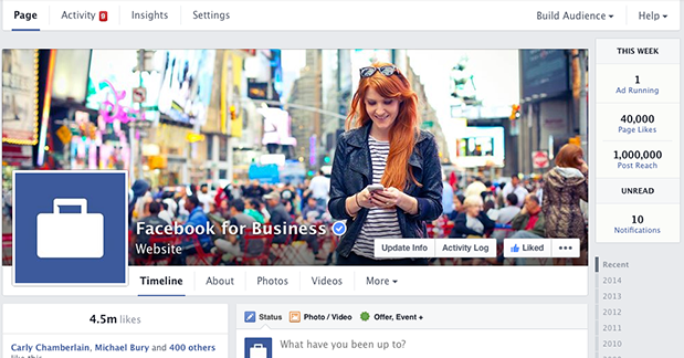
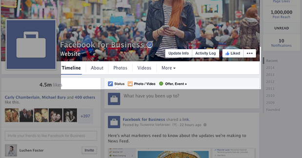
1) Single Column Format for Posts: Your Timeline is now on the right hand column, so you’ll no longer need to go back and forth to see posts on the left and right.
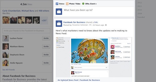
2) Left Column for Business Info: The left-hand column will include details about your business. Here you’ll see things like number of page likes, a map (if you have one), website address, hours of operation, contact info, friends who like your page, the “About” info, photos and videos.
3) Easy Access to Admin Tools: In the past, there was a panel at the top that pushed everything down. It’s actually quite annoying. Now you’ll get an admin navigation at the top that includes things like Page, Activity (notifications), Insights, Settings, Build AudienceThis is the group of people who can potentially see your ads. You help influence this by adjusting age, gender, location, detailed targeting (interests and behaviors), custom audiences, and more. More and Help. This navigation will exist no matter where you are within the page.
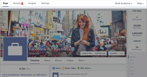
4) This Week: On the right hand side, you’ll see a quick overview of the number of ads running, number of page likes and post reachReach measures the number of Accounts Center Accounts (formerly users) that saw your ads at least once. You can have one account reached with multiple impressions. More for the current week, number of unread messages and notifications.
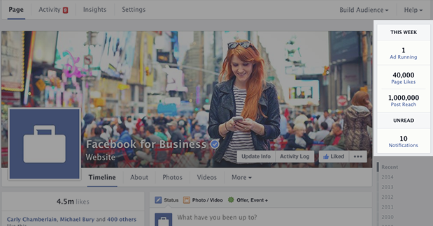
5) Tabs Buried: Your tabs no longer exist as boxes immediately below your cover photo. They are now accessed within a “More” drop-down.
No, the Tabs Update Isn’t a Big Deal
You probably thought that my “one important change” would be regarding tabs. No, it’s not.
As I discussed over a year ago now, I don’t think this is a big deal. Yes, I think tabs are valuable for first impressionsImpressions are the number of times your ads were displayed to your target audience. Impressions aren't counted if it is detected they came from bots. More and acquisition when users come to your page for the first time.
But after that, only 2% of your fans ever return to your page. So if you don’t drive traffic to them, they make very little impact.
The key to the success of tabs was and will continue to be your ability to drive traffic to them. Use organic posts that drive people there. Create ads that drive people there, too.
The loss of tabs may actually increase engagement since your content will now be immediately below your cover photo. So there is a positive impact to consider here.
One Change That’ll Make the Biggest Impact
The changes I’ve mentioned so far are all cosmetic. They’re nice. The new design looks cleaner, and it’ll make management of pages easier.
But the one change I’m most excited about is a very minor detail…
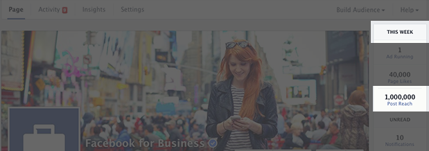
I’ve said repeatedly that we obsess far too much over post-by-post Reach. It just isn’t that important.
But that’s been mainly Facebook’s fault. They throw that number at us at every turn, so it’s natural that we react the minute one post seems to be reaching fewer people.
The truth is that we should be posting multiple times per week — and hopefully multiple times per day. As a result, our focus should be more on the number of people we’re reaching during a given day or week (if we focus on Reach at all).
I tend to have a Daily Total Reach that is about 5-10 times that of the Total Reach of an individual post, and Weekly Total Reach is about 50-100 times.
Now, this is also influenced by advertising, so it would be helpful if Facebook would instead show us the Weekly Organic Reach (mine is closer to 10 times that of an individual post). But I remain optimistic this change is being made.
I’m holding out hope that this will help shift the perception of marketers away from their post-by-post Reach and towards larger sample sizes. Given user behavior and the fact that it’s impossible — filtering algorithm or not — to reach a high percentage of fans with a single post, this shift is necessary.
Your Turn
What do you think about these changes? Which do you think is most important?
Let me know in the comments below!